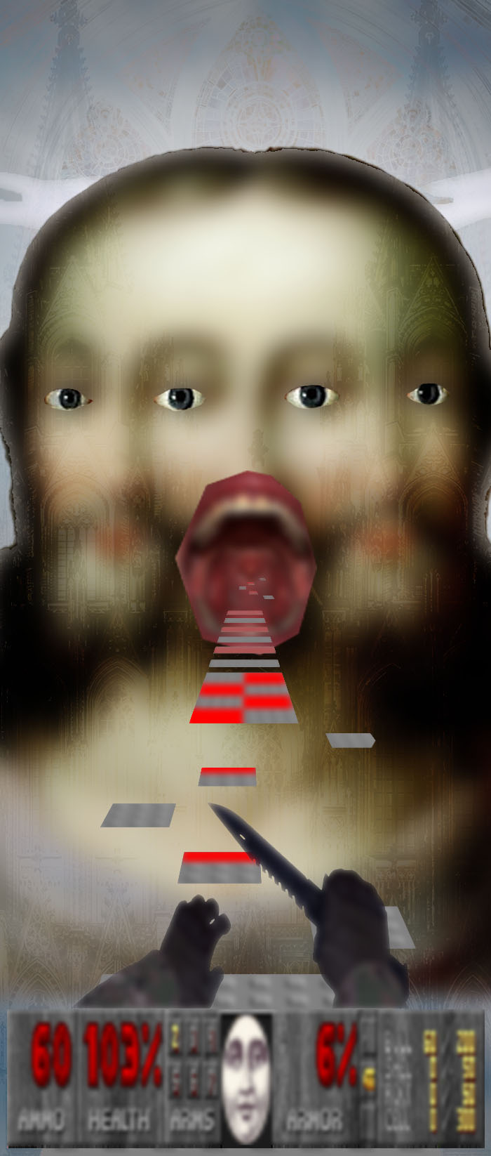
this was for a school assignment. it's technically supposed to be a doorhanger, hence the very vertical aspect ratio. but the teacher is chill as fuck and gives you a lot of creative freedom, so i could express my weirder more experimental art style that teachers would usually tell me is 'ugly' or 'graphically incorrect' or 'low effort' (because i dont use all of the techniques they teach us). i had a lot of fun making this and am extremely grateful to have a teacher that embraces my art style and doesn't try to put me in a box, like that other teacher that i really hate that i could go on and on about but whatever. this was her feedback:
"It looks very distinctive, but I'm a fan! Great work. Usually I would note that the quality of the images is not the best, but in this case it fits the style of the door hanger perfectly. I assume this was your intention as well? I do like the overall look better without that image at the bottom."
it was, in fact, intentionally of lower quality. i love the blurry pixelated look of low quality images and always set my resolution to less than 1000 pixels. and i have never yet been able to explain this to a teacher, because to them everything needs to be as crisp and clean and high quality as possible. im beyond happy to have a teacher that understands it, even if it's still obviously kinda foreign to her, which i get.
← back